
Bringing Imagination and Creativity…
To My Portfolio
I work hard to bring each design my best effort and talent.

I work hard to bring each design my best effort and talent.





WHO AM I
David Lovett has always been an artist at heart, choosing a creative path from a very young age. His journey in art began with painting and drawing, where he initially depicted familiar sights from his surroundings. When lacking something specific to mimic, he drew from his imagination, creating unique works that showcased his inventive spirit. It was clear early on that David was destined to be an artist.
In college, David pursued his passion for art with an open mind, exploring new artistic avenues such as pottery, sculpture, photography, digital art, and illustration. He found a love for each of these mediums, growing and learning along the way. This period of growth solidified his dream of becoming both an artist and a designer.
After acquiring a design degree in Visual Communications and Graphics, David embarked on a professional career as a designer and illustrator. He has worked for top companies in the country, developing and fine-tuning his skills. His thirst for knowledge led him to pursue further education, earning a bachelor’s degree in marketing and a Master of Information Systems to enhance his expertise.
With an unwavering passion for the arts, David continues to work on designs, paintings, sculptures, illustrations, and pottery, creating visual and unique pieces of art. He believes that imagination is a powerful tool capable of unlocking dreams and hopes to inspire others through his work.
Ya Gotta Lovett!
David Lovett – Visual Designer, Illustrator & Author


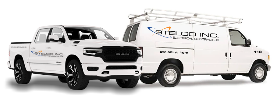
Re-branded Stelco Inc., from logo to all collateral and advertising. Being almost a fifty year old company, many aspects needed to be brought into the twenty-first century. Beginning with the company logo, Stelco was re-branded and re-established in the electrical community. Advertisements were placed both digitally and physically increasing awareness by 63%.
Stelco’s logo is designed with Square 721 font family, utilizing Pantone colors consisting of PMS715, PMS7687 and PMS Black. Symbolism of electrical paths are added for a visual affect of movement within the logo.

Corporate Identity is the basis of your company’s existence. Your brand and identity are what is going to stick in people’s minds and remember you company. For Stelco, their Corporate Identity consists of business cards, letterhead, envelopes, all contracts and legal documents, brochure, advertising, badges, vehicles and uniforms. Everything boils down to the existence of your identity.
First awareness of any business to any potential client is their website. A strong website is the first marketing tool any company should invest in. This is your first and possibly your only interaction with a client. A website should strike interest immediately and draw the viewer in. Stelco’s new 2023 website and marketing plan follows this scenario. With the development of Stelco’s new website, Stelco has received over 9600+ new visitors in the past year, between the regular site and the mobile site.
For local awareness, OOH Advertising was utilized to establish awareness and stability within the community. Billboards and Ads were placed locally. Estimating an ROI of 15-20%. Stelco’s billboards span the highway and local roads.
Online and Digital Marketing was utilized as well, to reach a larger market outside the local area. Product sales and services being offered increased dramatically by 45%.








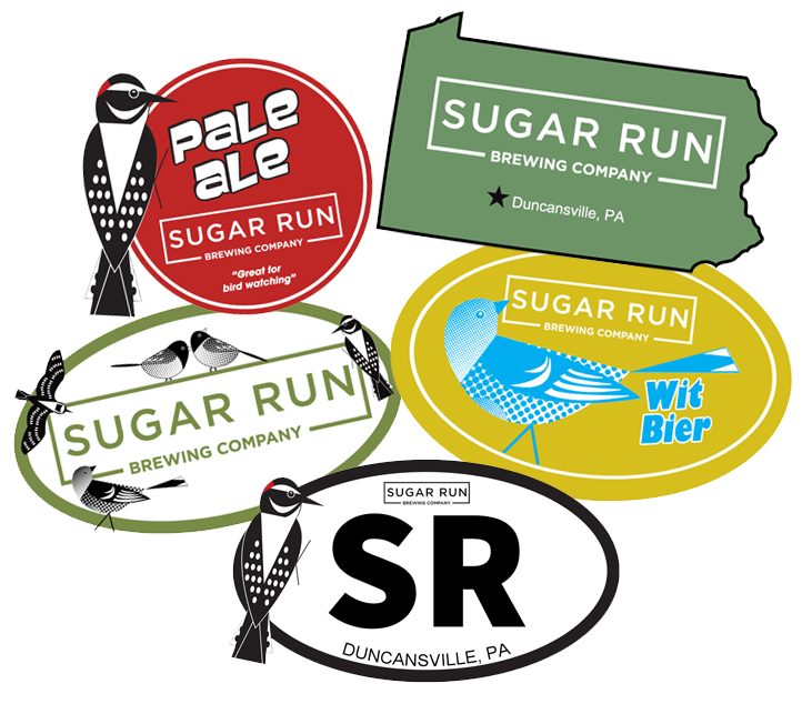


As the craze for fresh brewed beer pours throughout the country, new breweries are popping up everywhere. Sugar Run Brewery in Duncansville, PA is one of the newest in the area. They brew high quality, delicious beers and serve outstanding meals to pair with their beers.
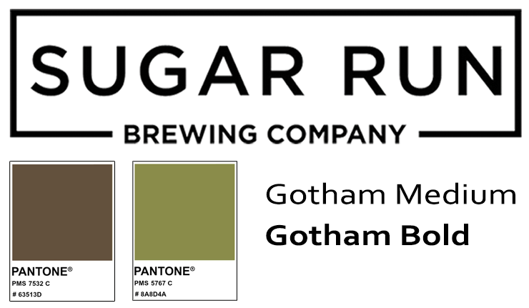
As the brewery grows, they decided to can their beers for take-out and for distribution. This required custom label designs and illustrations to portray the branding of the company. After collaborating with the owner it was determined that they would like custom bird illustrations to portray their brand.
With the development of the beer labels, came the companies look and branding. This look was then carried throughout the rest of the companies marketing and advertising materials. Merchandising is a large part of the brewery so the designs were then altered to make t-shirts, (another way to make money and get free advertising.)
In-house advertising for food and drink specials were also created. Carrying through the look and feel of the company.


What’s the popular hangout, that’s right The Meadows – Original Frozen Custard! Since the 50’s people have been going to The Meadows on a hot (and cold, I can’t explain it) day. Each day they present special flavors for the day. Beginning as a single owned ice cream store, The Meadows is now a successful franchise with an annual revenue of up to 5 million dollars.
Let’s get back to the 50’s, when it opened. All their artwork was from then as well. When it came time to franchise and become modern there was no digital artwork, plus they were beginning new aspects which didn’t have any branding. The first thing was to recreate the original Ice Cream Cone. I recreated the cone logo in Adobe Illustrator, embellishing on the design slightly. The Cone Logo and Main Logo utilize the same colors. Pantone System Colors, PMS 141, PMS 803, PMS 2756 and PMS 1395. With these colors all logos are produced. Fonts: Brush Script MT and Arial Black.

The Meadows was expanding and introducing a coffee bar. The next step was to determine a name and branding for this new aspect of the company. The Meadows Espresso Bar & Cafe became the winner after many iterations. I created a new brand, logo and some icons for the espresso bar identity.
There are many aspects to the ice cream store, signs, counter and drive-thru menus and advertising became a focus for consistency and branding within all franchises.


Marketing, marketing, marketing…it’s what makes the work go around. We work with various other marketing companies that come to us for a cohesive company design. Digi Marketing, was one of those company’s. Digi Marketing specializes in digital marketing tactics for online and websites. Competing in that market, with it being very saturated, a company needs to stand out above the rest. In both service and appearance. A cohesive company look and feel with memorable avatars should do the trick, that was my plan.
Digital and online marketing is a very extensive and integrated industry. With my efforts, they have an estimated client list of over 500,000 users.
They wanted a robot, so I started there. My robot needed to be different. I see many robots and they all look the same. I also wanted mine to be more personable and…cute. A non-aggressive robot, that’s here to help. So this is what I came up with. Digibot!
There are many services with Digi Marketing, so each service has it’s own robot avatar. Adorned with the look of that service. (Too many to show them all)
The Digi Marketing website is the biggest marketing tool they utilize. The site was built on a dynamic platform allowing for expansion and updates. The color scheme, as well as, the look and feel of the digibots continues through the site design. Reinforcing the colors and branding.
Advertising…Digital Advertising! That’s what it’s all about. Digital advertising has been the leading marketing tool for this generation. There are an incredible number of different aspects to digital marketing. Digi Marketing tries to encompass all, or as many as they can. Email marketing, website marketing, Google Ads, Social Media marketing, the list goes on. Here are a few examples of the ads used for Digi.
Then in the end…there was a Digibot battle to eliminate all the old and worn out robots.


